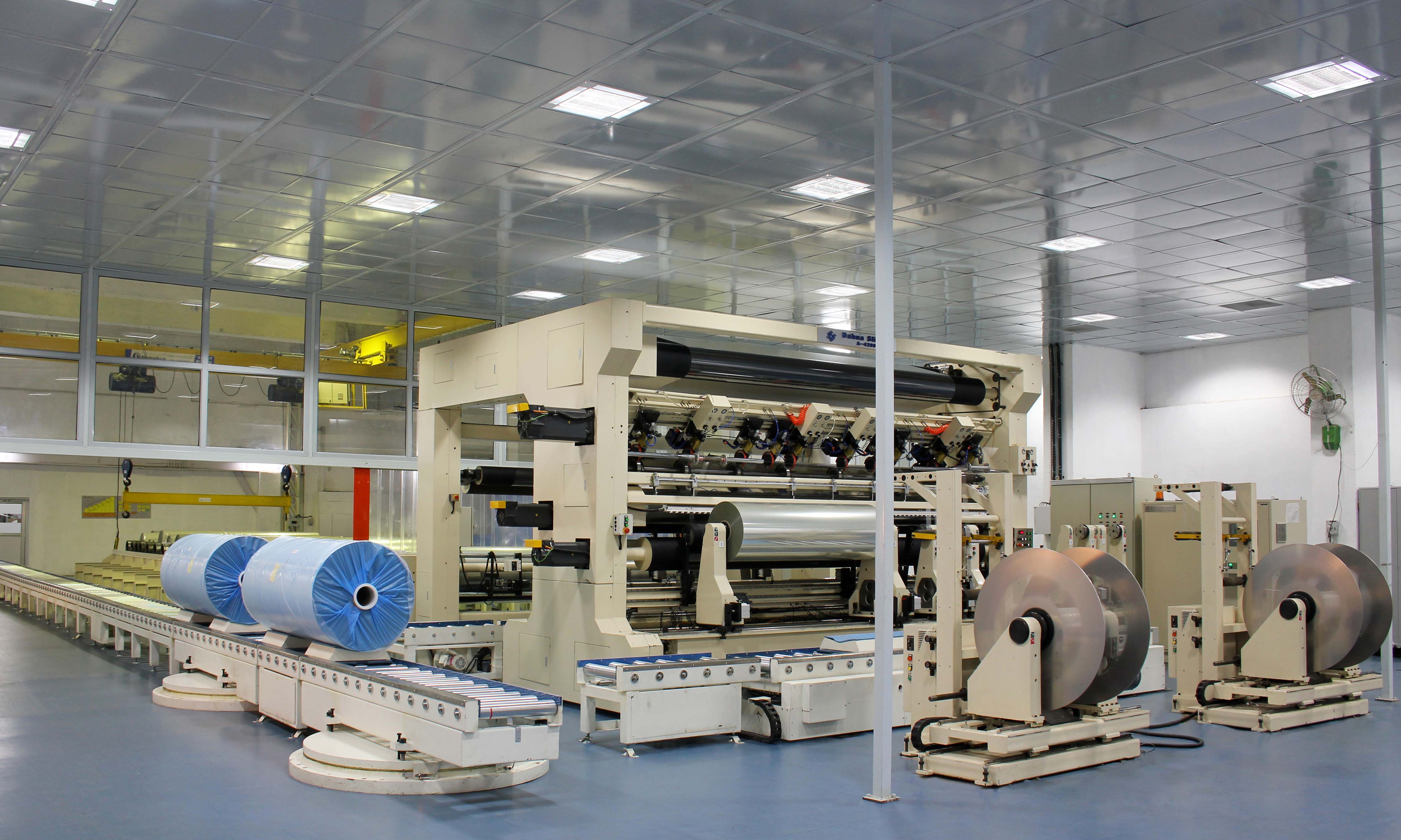
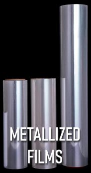
Through the years, IGS Chemicals has striven to bring customers all over the world excellent product and service.
+1-855-WIN-FILM (946-3456)
contact@igschemicals.com

ScaffoldingBased on TwitterBootstrap

Requires HTML5 doctype

Bootstrap makes use of certain HTML elements and CSS properties that require the use of the HTML5 doctype. Include it at the beginning of all your projects.

  1. <!DOCTYPE html>
  2. <html lang="en">
  3. ...
  4. </html>

Typography and links

Bootstrap sets basic global display, typography, and link styles. Specifically, we:

  • Remove margin on the body
  • Set background-color: white; on the body
  • Use the @baseFontFamily, @baseFontSize, and @baseLineHeight attributes as our typographic base
  • Set the global link color via @linkColor and apply link underlines only on :hover

These styles can be found within scaffolding.less.

Reset via Normalize

With Bootstrap 2, the old reset block has been dropped in favor of Normalize.css, a project by Nicolas Gallagher and Jonathan Neal that also powers the HTML5 Boilerplate. While we use much of Normalize within our reset.less, we have removed some elements specifically for Bootstrap.

Live grid example

The default Bootstrap grid system utilizes 12 columns, making for a 940px wide container without responsive features enabled. With the responsive CSS file added, the grid adapts to be 724px and 1170px wide depending on your viewport. Below 767px viewports, the columns become fluid and stack vertically.

1
1
1
1
1
1
1
1
1
2
3
4
4
5
9

Basic grid HTML

For a simple two column layout, create a .row and add the appropriate number of .span* columns. As this is a 12-column grid, each .span* spans a number of those 12 columns, and should always add up to 12 for each row (or the number of columns in the parent).

  1. <div class="row">
  2. <div class="span4">...</div>
  3. <div class="span8">...</div>
  4. </div>

Given this example, we have .span4 and .span8, making for 12 total columns and a complete row.

Offsetting columns

Move columns to the right using .offset* classes. Each class increases the left margin of a column by a whole column. For example, .offset4 moves .span4 over four columns.

4
3 offset 2

3 offset 1
3 offset 2

6 offset 3

  1. <div class="row">
  2. <div class="span4">...</div>
  3. <div class="span3 offset2">...</div>
  4. </div>

Nesting columns

To nest your content with the default grid, add a new .row and set of .span* columns within an existing .span* column. Nested rows should include a set of columns that add up to the number of columns of its parent.

Level 1 column

Level 2
Level 2
  1. <div class="row">
  2. <div class="span9">
  3. Level 1 column
  4. <div class="row">
  5. <div class="span6">Level 2</div>
  6. <div class="span3">Level 2</div>
  7. </div>
  8. </div>
  9. </div>

Live fluid grid example

The fluid grid system uses percents instead of pixels for column widths. It has the same responsive capabilities as our fixed grid system, ensuring proper proportions for key screen resolutions and devices.

1
1
1
1
1
1
1
1
1
1
1
1
4
4
4
4
8
6
6
12

Basic fluid grid HTML

Make any row “fluid” by changing .row to .row-fluid. The column classes stay the exact same, making it easy to flip between fixed and fluid grids.

  1. <div class="row-fluid">
  2. <div class="span4">...</div>
  3. <div class="span8">...</div>
  4. </div>

Fluid offsetting

Operates the same way as the fixed grid system offsetting: add .offset* to any column to offset by that many columns.

4
4 offset 4

3 offset 3
3 offset 3

6 offset 6

  1. <div class="row-fluid">
  2. <div class="span4">...</div>
  3. <div class="span4 offset2">...</div>
  4. </div>

Fluid nesting

Fluid grids utilize nesting differently: each nested level of columns should add up to 12 columns. This is because the fluid grid uses percentages, not pixels, for setting widths.

Fluid 12

Fluid 6

Fluid 6
Fluid 6
Fluid 6
  1. <div class="row-fluid">
  2. <div class="span12">
  3. Fluid 12
  4. <div class="row-fluid">
  5. <div class="span6">
  6. Fluid 6
  7. <div class="row-fluid">
  8. <div class="span6">Fluid 6</div>
  9. <div class="span6">Fluid 6</div>
  10. </div>
  11. </div>
  12. <div class="span6">Fluid 6</div>
  13. </div>
  14. </div>
  15. </div>

Fixed layout

Provides a common fixed-width (and optionally responsive) layout with only <div class="container"> required.

  1. <body>
  2. <div class="container">
  3. ...
  4. </div>
  5. </body>

Fluid layout

Create a fluid, two-column page with <div class="container-fluid">—great for applications and docs.

  1. <div class="container-fluid">
  2. <div class="row-fluid">
  3. <div class="span2">
  4. <!--Sidebar content-->
  5. </div>
  6. <div class="span10">
  7. <!--Body content-->
  8. </div>
  9. </div>
  10. </div>

Enabling responsive features

Turn on responsive CSS in your project by including the proper meta tag and additional stylesheet within the <head> of your document. If you’ve compiled Bootstrap from the Customize page, you need only include the meta tag.

  1. <meta name="viewport" content="width=device-width, initial-scale=1.0">
  2. <link href="assets/css/bootstrap-responsive.css" rel="stylesheet">

Heads up! Bootstrap doesn’t include responsive features by default at this time as not everything needs to be responsive. Instead of encouraging developers to remove this feature, we figure it best to enable it as needed.

About responsive Bootstrap

Responsive devices

Media queries allow for custom CSS based on a number of conditions—ratios, widths, display type, etc—but usually focuses around min-width and max-width.

  • Modify the width of column in our grid
  • Stack elements instead of float wherever necessary
  • Resize headings and text to be more appropriate for devices

Use media queries responsibly and only as a start to your mobile audiences. For larger projects, do consider dedicated code bases and not layers of media queries.

Supported devices

Bootstrap supports a handful of media queries in a single file to help make your projects more appropriate on different devices and screen resolutions. Here’s what’s included:

Label Layout width Column width Gutter width
Large display 1200px and up 70px 30px
Default 980px and up 60px 20px
Portrait tablets 768px and above 42px 20px
Phones to tablets 767px and below Fluid columns, no fixed widths
Phones 480px and below Fluid columns, no fixed widths
  1. /* Large desktop */
  2. @media (min-width: 1200px) { ... }
  3.  
  4. /* Portrait tablet to landscape and desktop */
  5. @media (min-width: 768px) and (max-width: 979px) { ... }
  6.  
  7. /* Landscape phone to portrait tablet */
  8. @media (max-width: 767px) { ... }
  9.  
  10. /* Landscape phones and down */
  11. @media (max-width: 480px) { ... }

Responsive utility classes

For faster mobile-friendly development, use these utility classes for showing and hiding content by device. Below is a table of the available classes and their effect on a given media query layout (labeled by device). They can be found in responsive.less.

Class Phones 767px and below Tablets 979px to 768px Desktops Default
.visible-phone Visible
.visible-tablet Visible
.visible-desktop Visible
.hidden-phone Visible Visible
.hidden-tablet Visible Visible
.hidden-desktop Visible Visible

When to use

Use on a limited basis and avoid creating entirely different versions of the same site. Instead, use them to complement each device’s presentation. Responsive utilities should not be used with tables, and as such are not supported.

Responsive utilities test case

Resize your browser or load on different devices to test the above classes.

Visible on…

Green checkmarks indicate that class is visible in your current viewport.

  • Phone✔ Phone
  • Tablet✔ Tablet
  • Desktop✔ Desktop

Hidden on…

Here, green checkmarks indicate that class is hidden in your current viewport.

  • Phone✔ Phone
  • Tablet✔ Tablet
  • Desktop✔ Desktop

© 1999-2020 IGS Chemical
Proudly powered on MMS
468 North Camden Dr.
Beverly Hills, CA 90210 USA
Toll Free: +1 855-WIN-FILM (946-3456)
International: +1 424-317-4401
E-Mail: info@igschemicals.com
Web: https://igschemicals.com